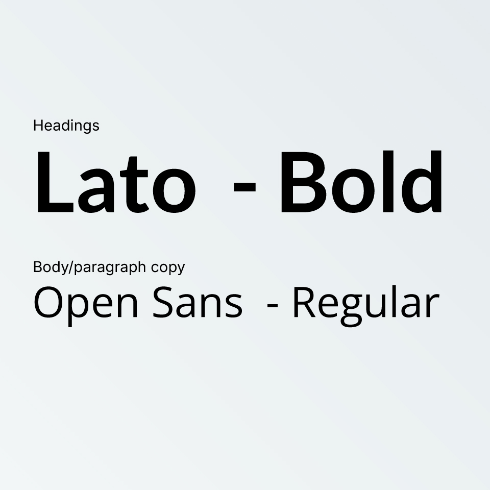
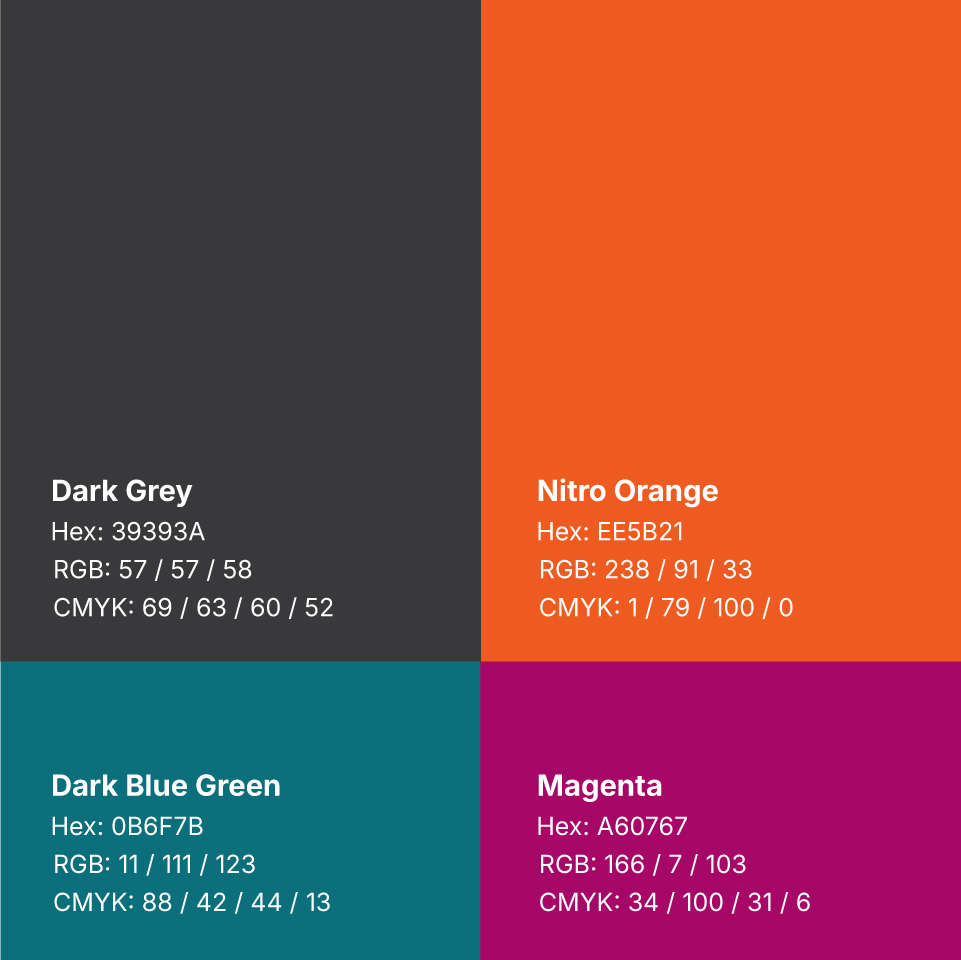
Nitro had never really defined their brand. Once I was promoted to Creative Team Lead, my first initiative was to get the entire company on the same page with a single brand identity.
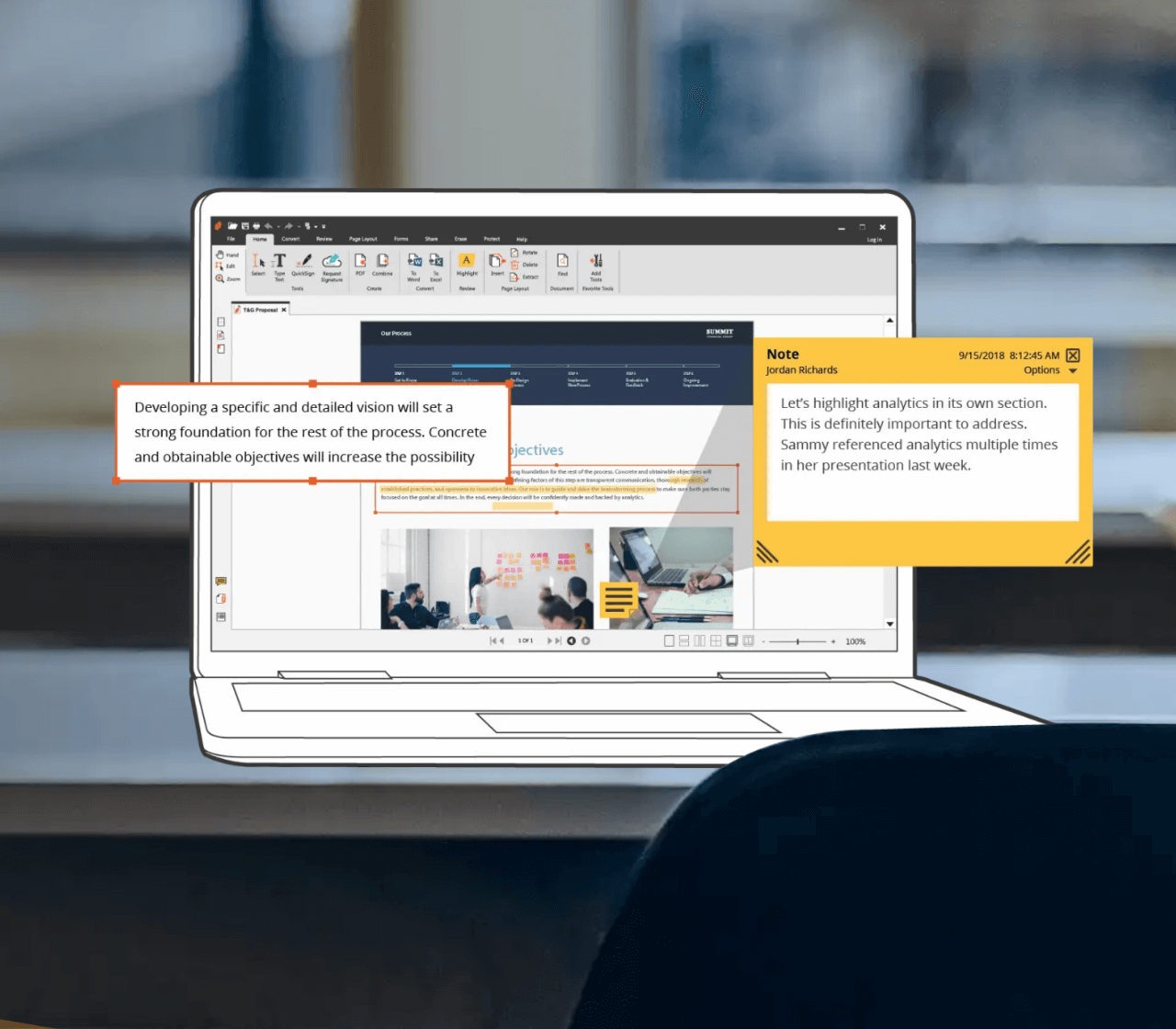
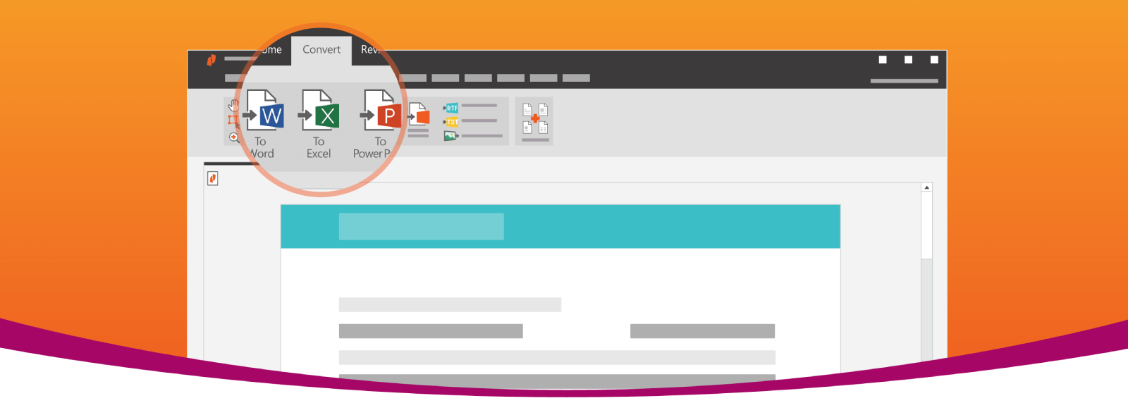
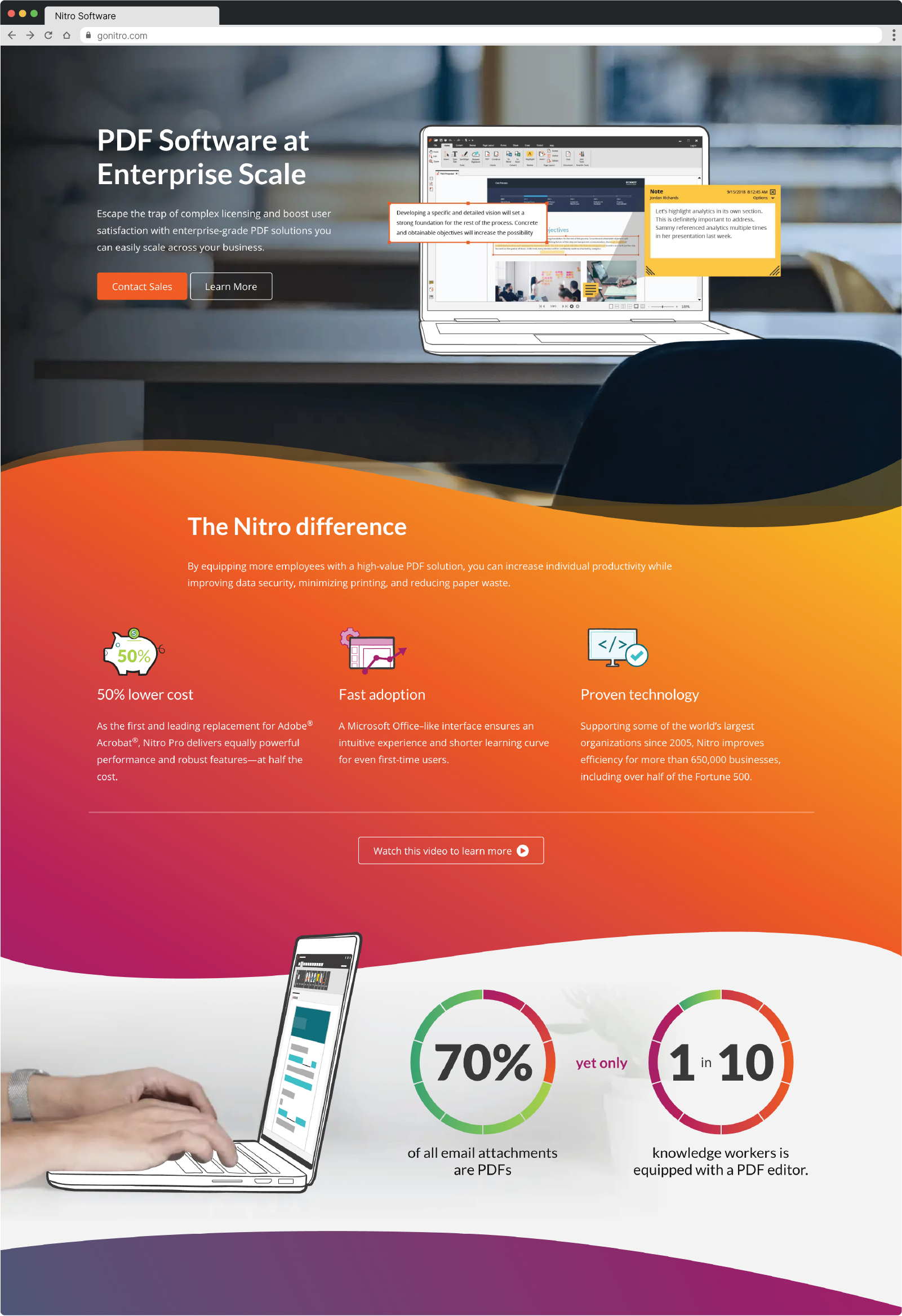
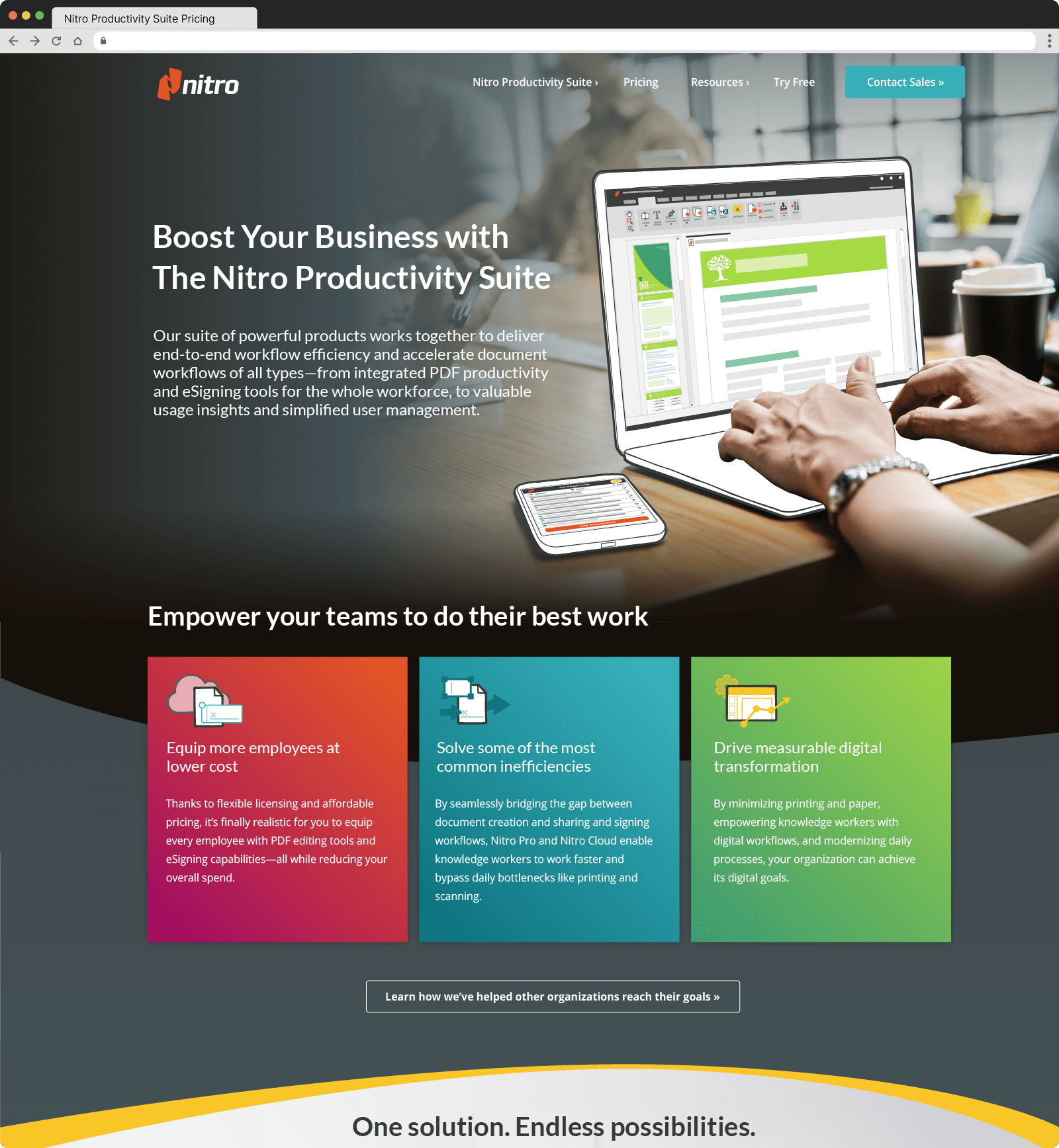
I led the entire process including competitive research, stakeholder interviews, team brainstorms, and creative concepting. I also directed the entire rollout which included a website re-architecture, redesign and rebuild.
I wanted to ensure that the Nitro brand reflected the company values, core culture, and growth as an organization. I also wanted to evolve the brand to a cohesive, enterprise-grade voice and aesthetic—without losing our unique personality and spirit.
I led a series of workshops with the entire global marketing team designed to establish the core pillars on which the entire brand would be built. We wanted to make sure the company values were included and I also talked to the CEO to get his thoughts on what he believed was the “soul” of Nitro.
After several hours of discussion and debate, we determined the 3 brand pillars that would serve as the building blocks for the entire brand moving forward.
Bold, Helpful & Authentic
The logo was an evolution of the previous logo rather than a full redesign. The icon is meant to resemble 2 documents as well as steps. I typeface is loosely based on Inter, but I adjusted every character a little bit.
I introduced hand-drawn illustrations as a way to create a human element. I wanted to incorporate photographs of people to support this connection.
I wanted the graphics and illustrations to feel like they were hand-drawn by a real person. To overcome the complication of producing these quickly, I created a series of brushes that I shared through our design library.
I brought in background gradients to add depth to the images. Curve elements break up sections of content to add a sense of flowing and movement. In order to be able to replicate these curve elements from designer to developer, I created a library of inline styled svgs and a series of css classes to be used.
I created an icon style that was replicated by our entire team as well as occasional freelancers. These were also in our team library for easy collaboration.
I directed the design of a series of modules to be used in Marketo (Nitro’s CRM). I also built and tested every single module within Marketo using Litmus to verify that each module displayed consistently across 28 different email clients.
I created an icon style that was replicated by our entire team as well as occasional freelancers. These were also in our team library for easy collaboration.
After launch, we received glowing reviews from customers and prospects. Bold, Helpful, and Authentic became a staple in all brand related discussions and the entire company jumped on board. I continued to run quarterly reviews with the entire marketing team to discuss how well we were executing on our brand promise as well.